Studio Refresh: Big Style in a Small Space with Crate and Barrel

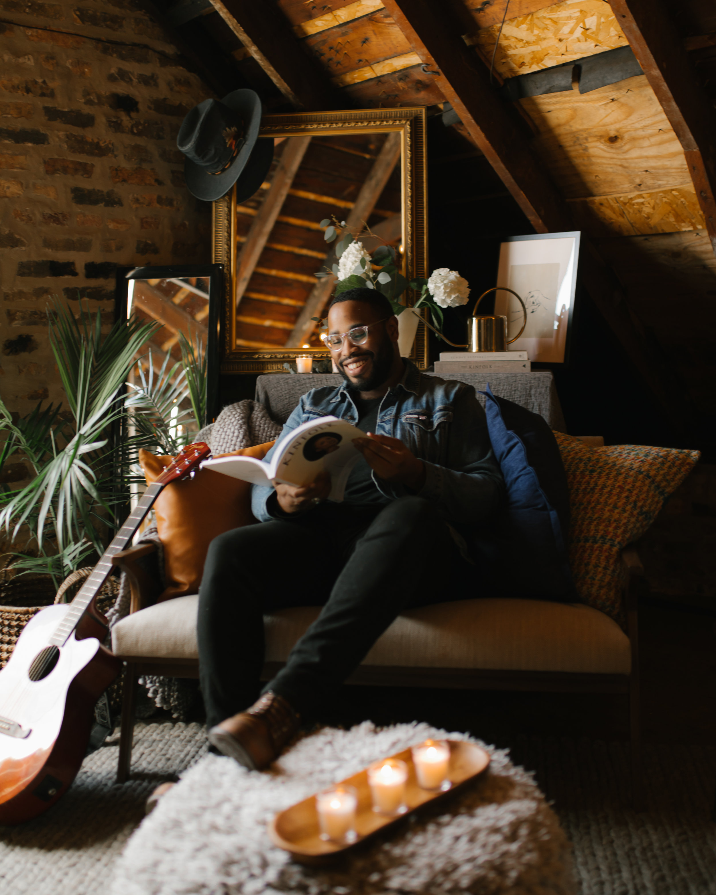
Cozy vibes on deck. Photo by Jesse Schroeder.
When I initially peeked into the attic that sits above my second floor apartment in Chicago, I didn’t think much of the space. It was dusty, full of old furniture, and frankly, not much to look at. It wasn’t until a few months later that I realized the potential it held— with natural light from a strong East-facing window, exposed beams and an A-frame ceiling, Studio 1037 has worked well for me as a portrait and product studio.
Over the last year and a half, the space has morphed and expanded for a variety of shoots, parties and creative experiments, but the time has come to settle on a fully designed space. My goals for the redesign included a welcoming flow, vignettes that are perfect for portraits, and a cozy seating area that encourages conversation and connection. That’s why I was so excited when Crate and Barrel reached out about collaborating on a design update for the studio! Like many spaces in big cities, Studio 1037 is small but mighty—so I thought I would share a few tips on making a small space feel like home.
Focus on Flow
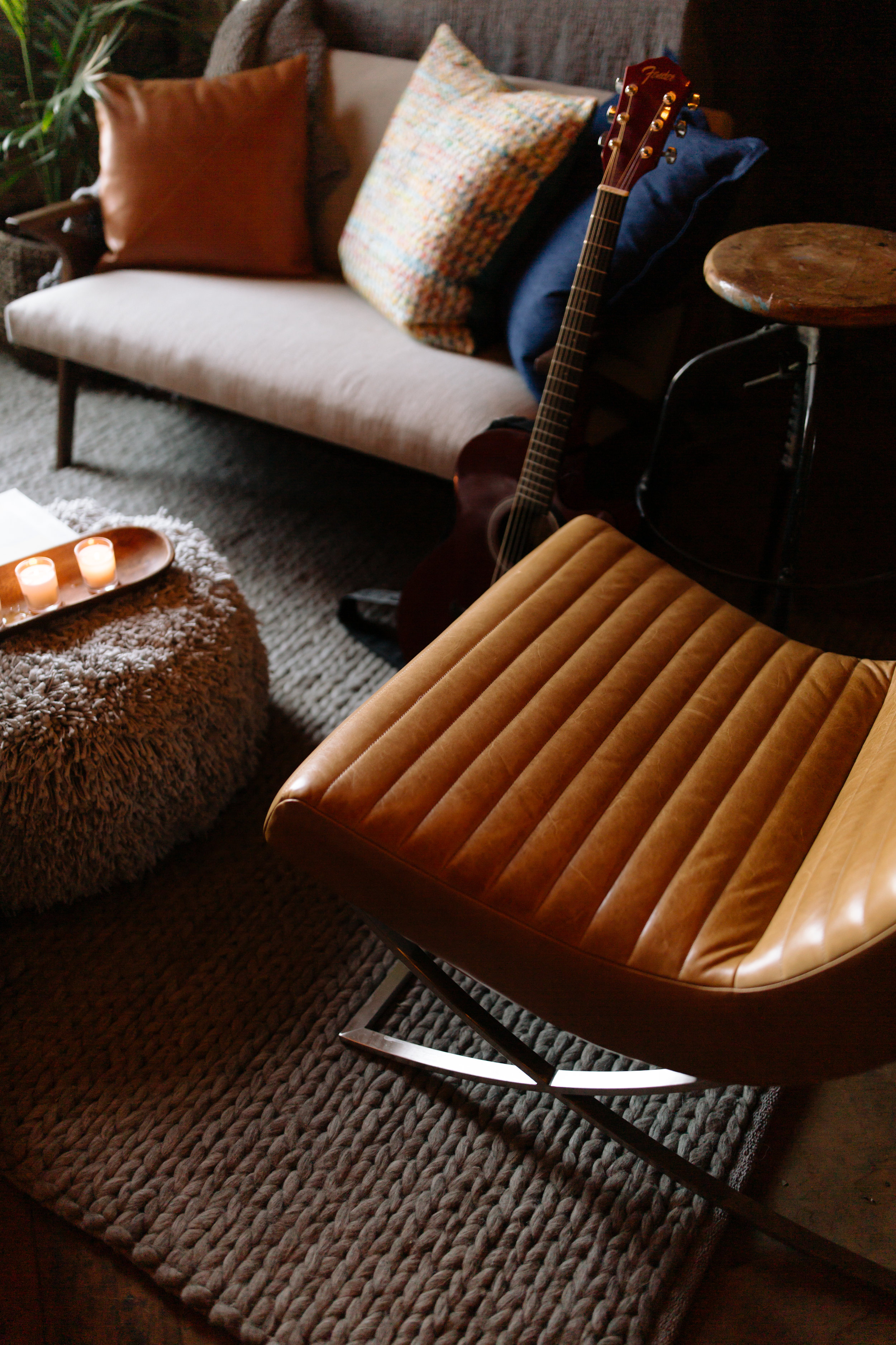
As with any room, think about how the space will be experienced. Just because a space is small doesn’t mean there’s only one option when it comes to flow. While the primary goal of the Studio is photography, I also wanted it to make sense when you walk in for a chat or a drink. To that end the conversation corner acts as the focus when you enter, and features the Cavett Wood Frame Loveseat, the Memphis Light Gray Pouf, a Cozy Weave Throw and the Cooper Armless Leather Chair—all stellar pieces that work really well together.
2. Create vignettes with purpose
Especially in spaces where maximization is key, vignettes keep your eyes dancing around the room. Each vignette should serve some sort of purpose, whether purely for the sake of functionality, or to further the aesthetic. Think of it as visual candy—too much will make you sick, but a little bit definitely makes the experience more enjoyable. The Wyatt Media Tower worked as a great backdrop for several vignettes, showcasing my love for gold accents, plants (featured in the Dundee Tabletop Planter and music—classic Aretha Franklin vinyl should always be on deck.
3. Think Big(ger)
Mirrors have long worked as a key to making a small space seem bigger, but placement for these is most important. Place them at strategic locations throughout the room to enhance any unique architectural moments that already exist, and in dead spots where you can create an opportunity to keep the visitor’s eye moving around the space. In Studio 1037, the mirrors also work as a fun photographic opportunity, adding dimension and a sense of intrigue to my portraits.
4. Candles = Cozy
It’s simple, but small flickering lights bring a new level of light, interest and drama to a space. I sprinkled small C&B votive candles throughout the room, added a set of taper candles to the Libations Bar Cart (because who doesn’t love a strong brass statement piece) and the Patchouli and Linen candle ensures that you immediately sense the vibe, even before you see it.
5. Every Piece Counts
Statements come in all shapes and sizes. For me, the success of a well-designed space includes a few large and confident statement pieces, along with smaller pieces that keep the heart of the room obvious. Invest in strong items the you know will last, and don’t be afraid to combine those with pieces of personal significance or antique/thrifted items. After all, no matter the size, your space should be a reflection of who you are—the sum of your history, your present and your future.
Artwork by Michael-Andrew Spalding.
All in all, I’m so excited that the studio now has so much more seating, a vibe that’s expanded and visually represented no matter where you look, and will definitely be home to many photo shoots, cocktail gatherings and record parties come Summer. Don’t let a small footprint stop you from making your space feel like home.
Happy decorating!
Wesley Taylor is a portrait and lifestyle photographer who enjoys capturing what it felt like to be there.


